Spotlight: The Artist’s Process
We asked some of our artists for the inside scoop on their process - we hope you enjoy these little features on the story, methods or inspiration behind on a few favourite works that we’ve had in the gallery.
Geoff Farnsworth: Island Girl
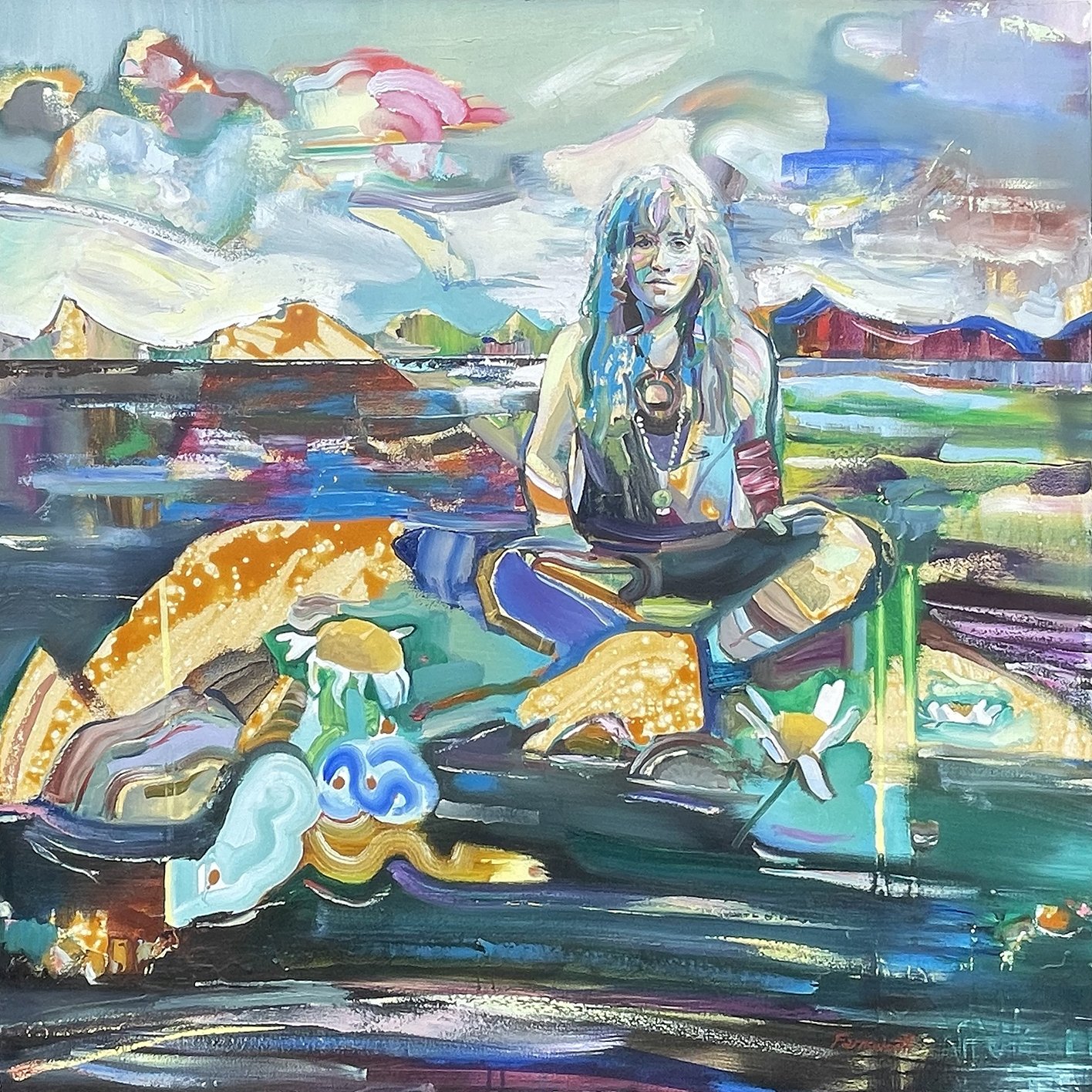
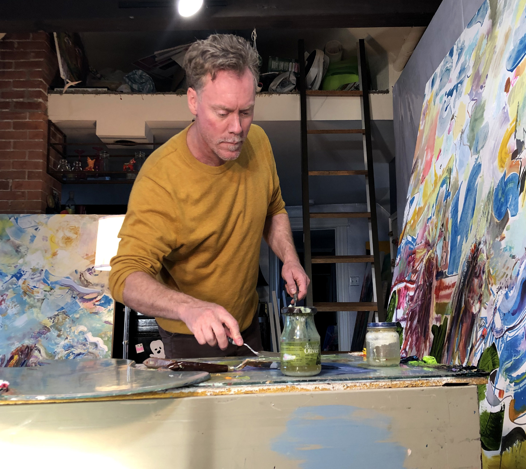
“Before moving to Niagara, we had been living in Thunder Bay for almost a year, where I had started becoming more interested in putting more landscape in with my figures, in abstracted ways. With being new in Niagara Falls at that time and just getting to know some of the musicians and artists in the art community there, I began painting many of these people as figures into these settings. So kind of a mish mash between Northern and Southern Ontario.
The figure here is based on Beth Moore. She has an incredible voice and was doing very well with her music at the time, having her songs featured on CBC and in a couple t.v. shows.”
Beverley Hawksley: Beach Stories
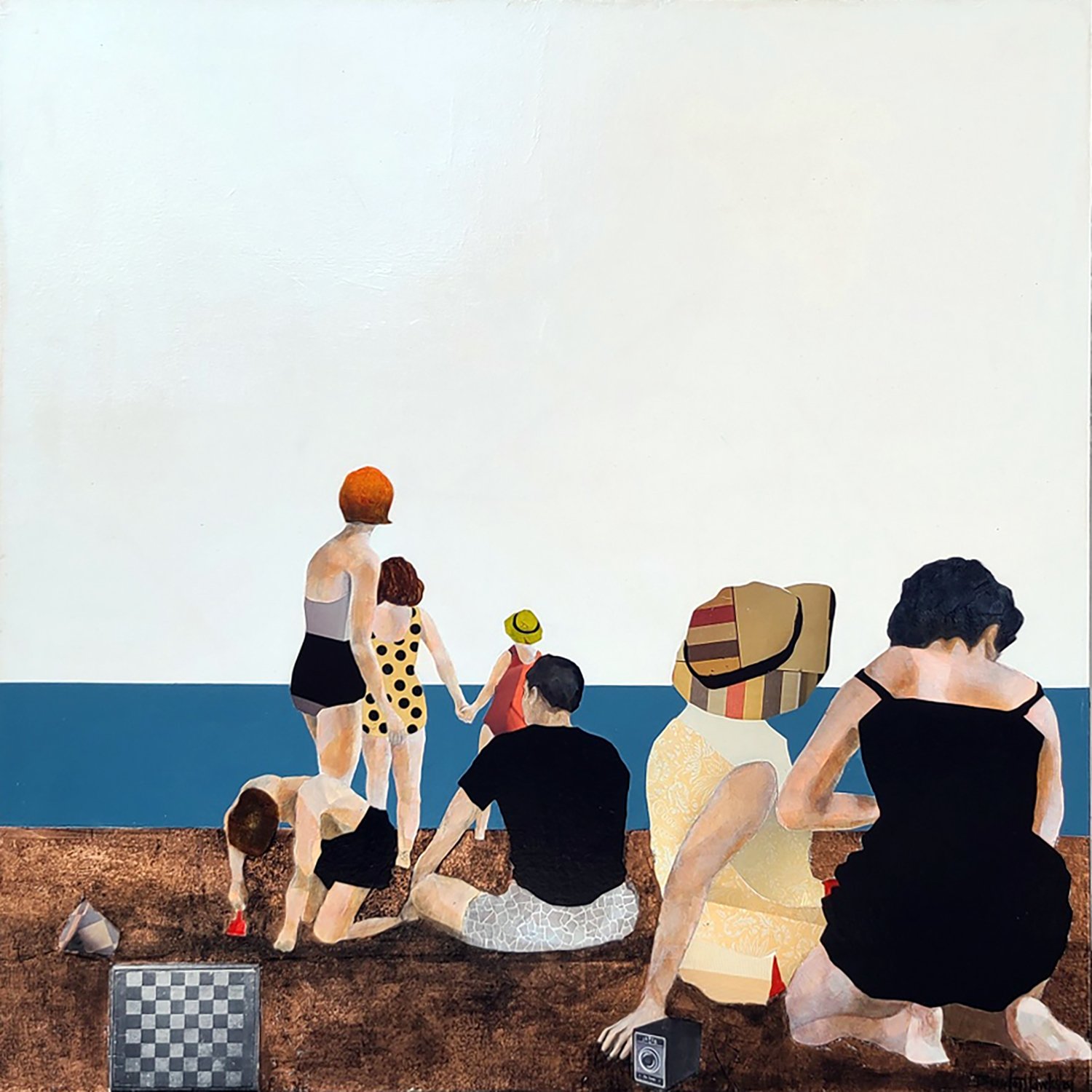
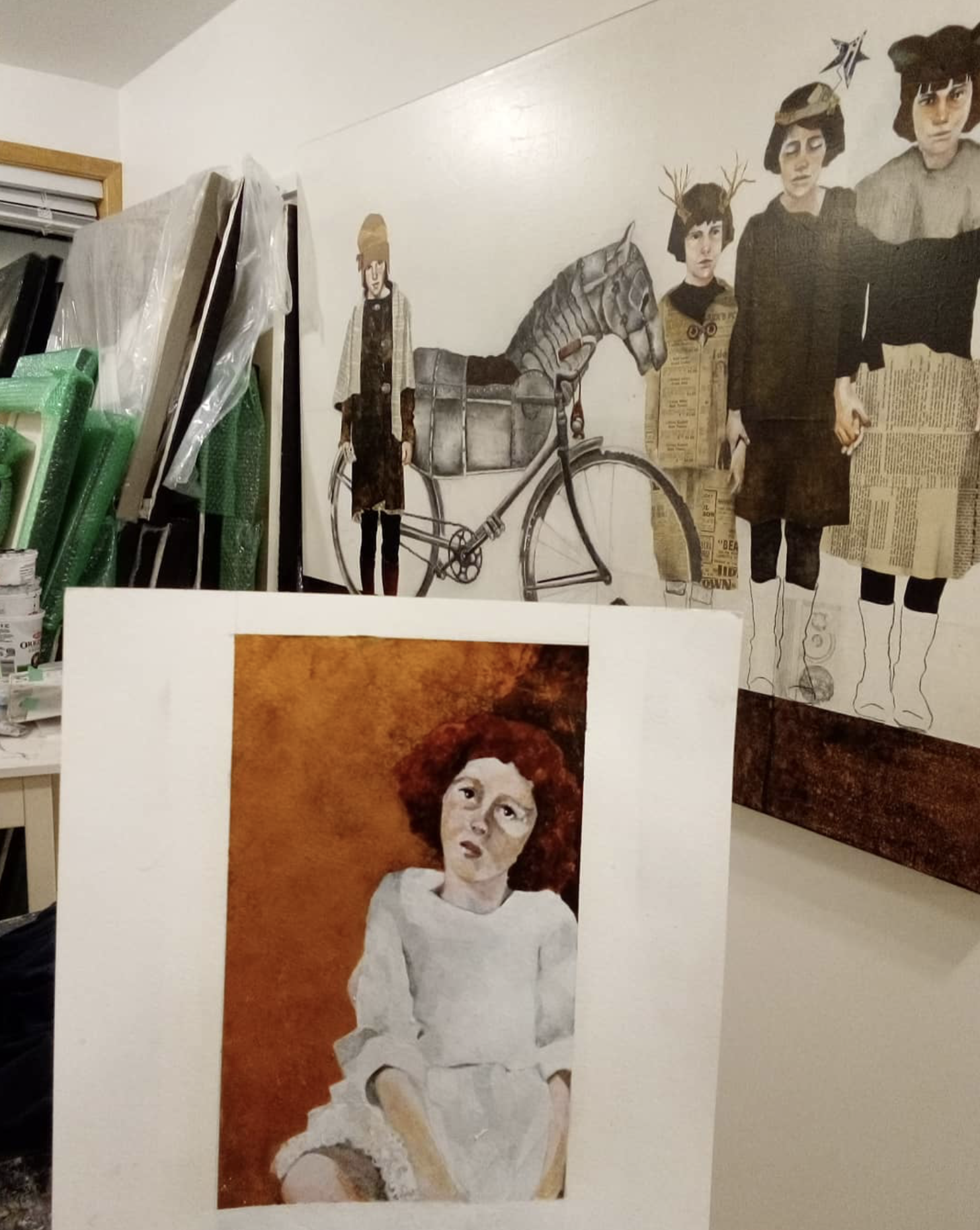
“The process of creating my work is very much about stories, and while the actual narrative can't always be named, the sentiment feels familiar to most people. Situations, states of mind and relationships are most often the focus of these stories.
"Beach Stories" began with a small, blurry vintage photo. Sometimes these photos are of my own family, sometimes they are given to me by others. This work is a mixed media piece consisting of acrylic paint, graphite, collage and copper leaf.
My style of mixing the visual feel of 2D and 3D gives me lots of leeway to let the figures communicate their personalities and they always have their own agenda. I do a lot of listening to them. Clothing, objects and composition rarely appear as in the original photo. The layers of discovery is what I look forward to the most! “
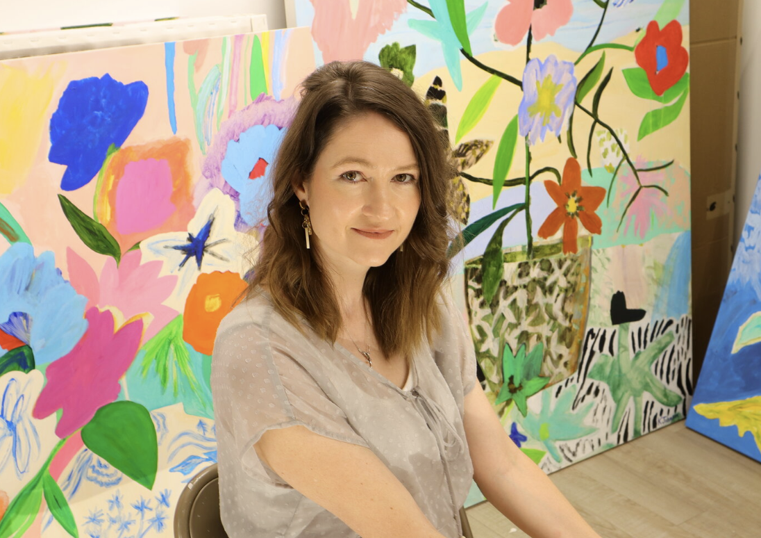
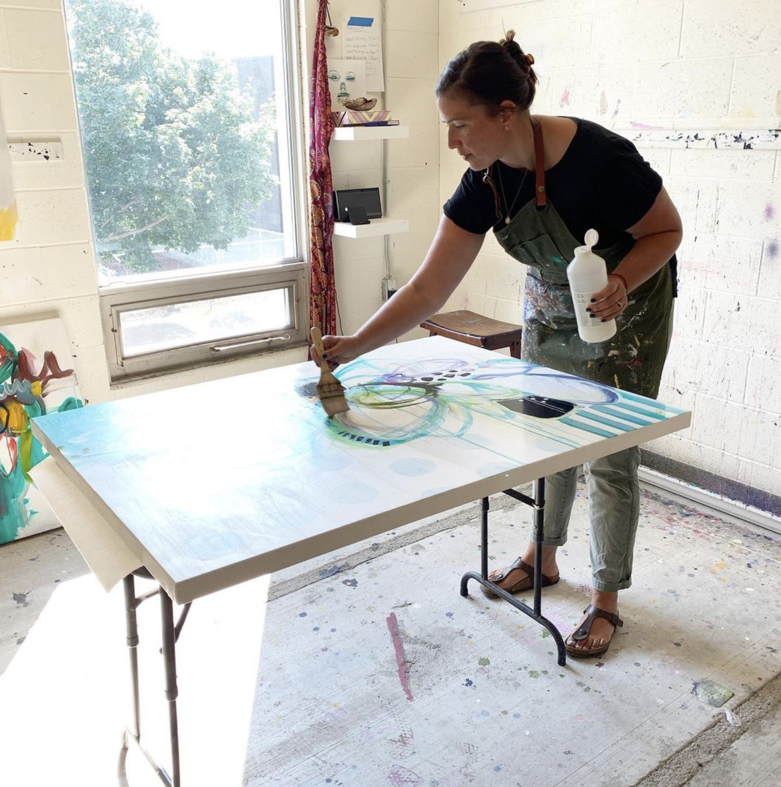
Kaitlin Johnson: Sunny Spring
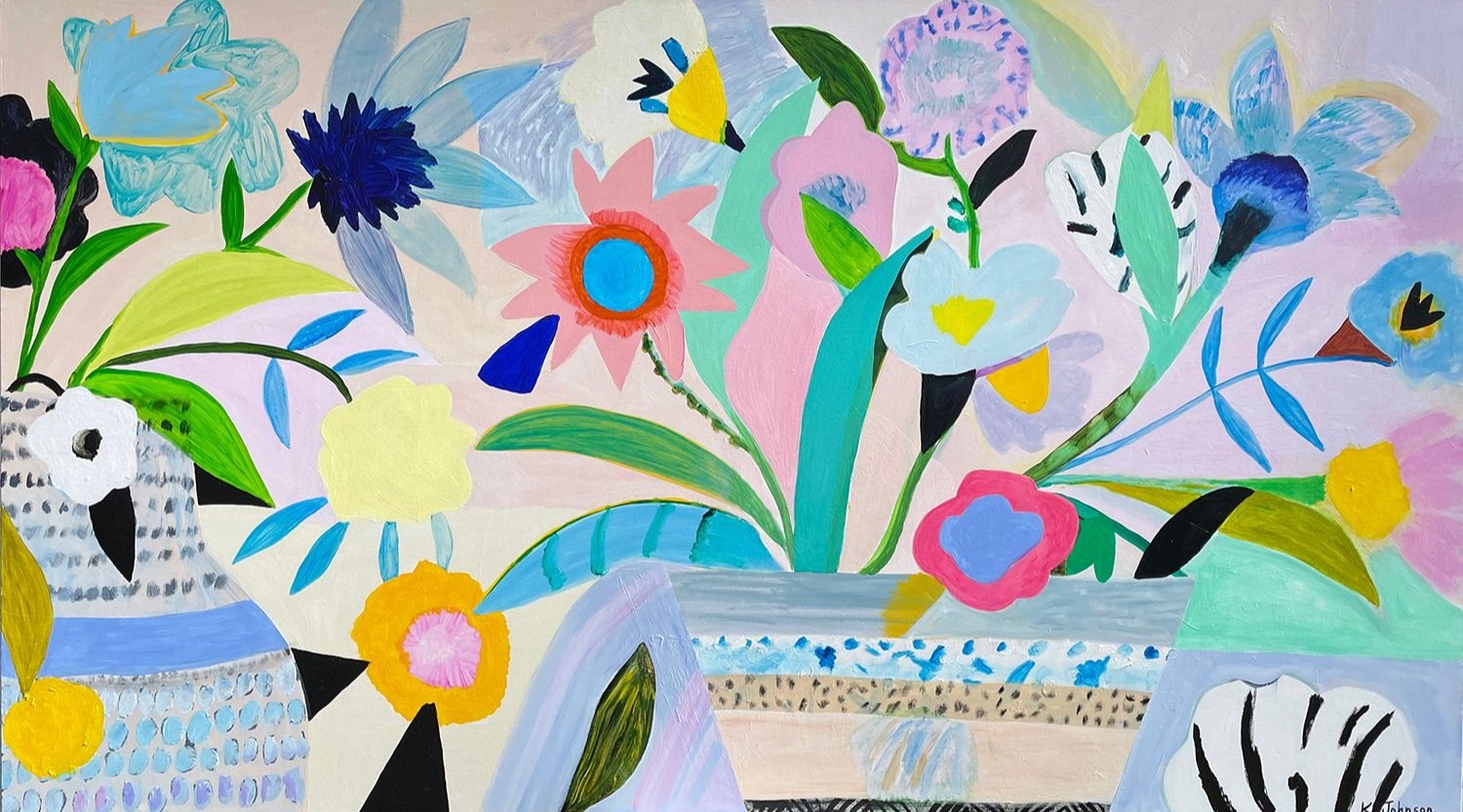
“This piece began with the loose outline of the vases along with a few blooms and leaves. The bright yellow flower came early on in the process and it became the star of the painting for me. All my colour choices after that were an attempt to complement this yellow bloom. Overall the colour scheme ended up being very fresh and light with lots of pale hues mixed with pops of vivid colour.
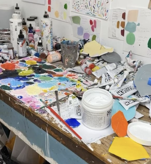
My work is equal parts experimentation and consideration. In every piece I need to have the freedom to play and be spontaneous but I also spend a lot of time looking at composition and thinking about balance. I have a bunch of painted card stock organic shapes that I tape onto the canvas, giving me a sense of what something will look like before commiting. I also use a painting app on my phone to allow me to test out ideas.
For this painting I used a lot of thin layers of paint. I like painting this way because it encourages whatever colour is underneath to blush through and adds a luminosity to the painting.I kept adding blooms, trimming some away, and changing colours until the painting came alive and became a harmonious whole.”
Claire Desjardins: Down by the Pond's Edge
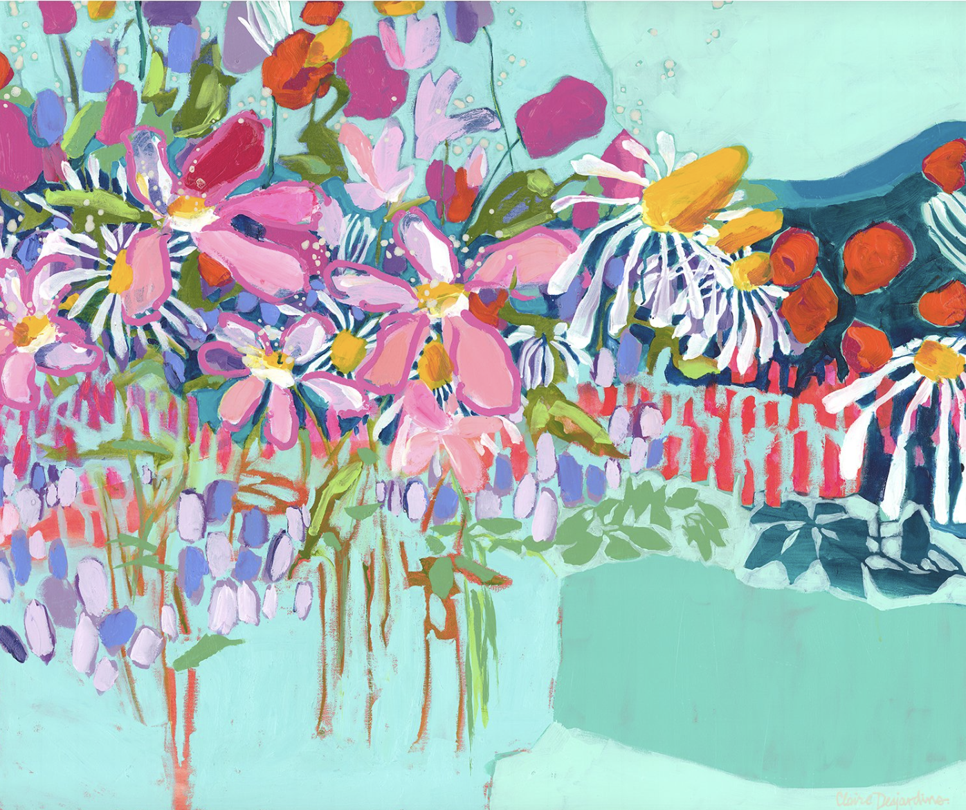
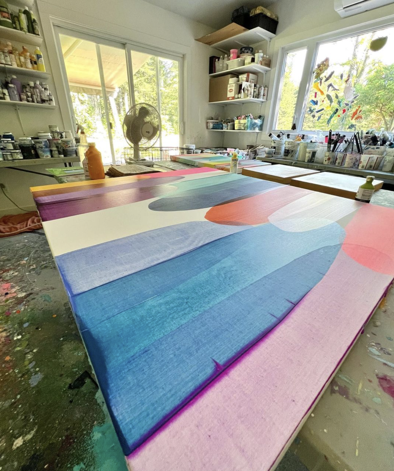
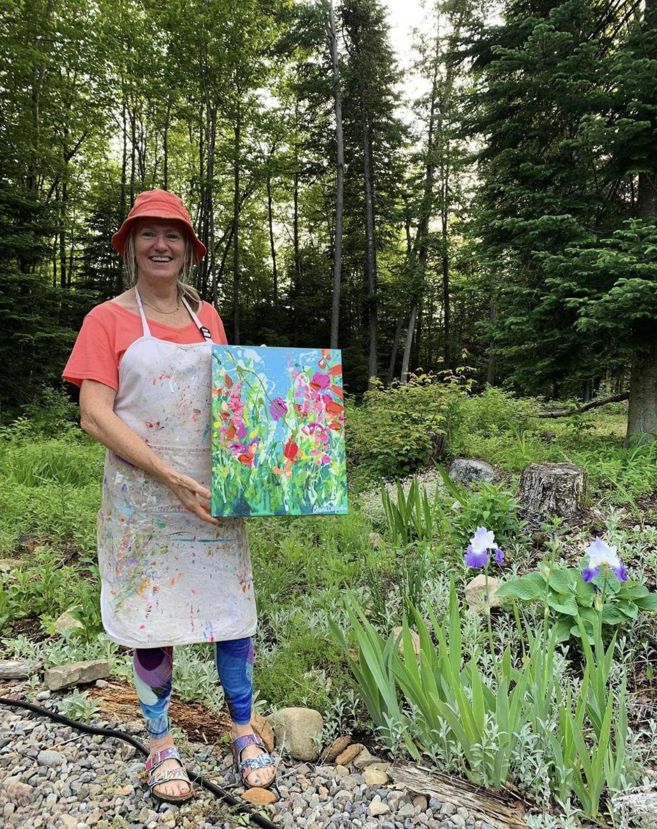
“I live in the natural beauty of the Laurentians, an hour north of Montreal, Quebec. I am surrounded by trees and water, and the creatures that inhabe those spaces. Our closest neighbours are squirrels, deer, and a family of beavers, which we observe on the lake which surrounds two sides of our house.
In the summer months, I do a lot of gardening. I love the way the breeze sways the many colours of my semi-wild garden, and I love watching the birds and creatures around me. The other day, I actually saw a couple of wild turkeys, on the point. I frightened one of them, and it made its way down into the water, and swam away— a turkey! I'd never seen one swim before!
Every day, I see things that amaze and inspire me. Nature is so delicately balanced, and so wonderful. That sentiment, I hope, finds its way onto my canvases, such as Down by the Pond's Edge.”
Learn more about Claire and her work here
Julie Hawkins: Nothin’ More To Say
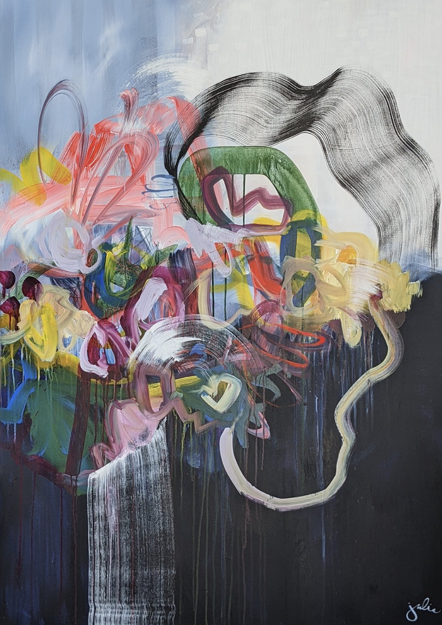
“A friend of mine came to visit at my studio along with her eight year old daughter. We asked her daughter what she thought of this painting and after a short contemplation she said ‘It’s kind of cool because the dark is trying to defend itself, but all the colour is trying to take over the darkness so that it can create a better world.” It was such a beautiful description from a clever young mind. I really cherish her words, and I think most of us could relate to this story in some way. The contrast between darkness and light resides within all of us.
This piece is named after lyrics in one of my favourite songs,’Superstition’ by Stevie Wonder. I always listen to music when I’m painting. Singing along gets me out of my head and allows me to be present in a creative flow. When I have finished a piece I look back over the songs I’ve been listening to, and find lyrics that seem to fit the piece somehow. This piece has so much contrast, colour, and energy that there is 'nothin' more to say’.”
Linelle LeMoine: Persephone and Her Spring Blooms #2
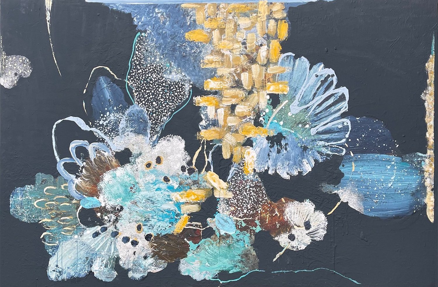
Linelle LeMoine’s mixed media works are the result of creative bravery and play. “Nothing is precious” is the motto as she throws the kitchen sink at a panel and begins to edit things down. She frequently experiments with found objects and their mark-making capabilities; paper towel imprints create a spotted texture while a garlic peeler can add a defined shape that is found in repetition throughout the piece. Happy accidents like cracks are filled with matte medium and covered up. If an entire panel doesn’t work out it gets sanded down.
She is constantly taking risks and layering colours such as a deep blue/black that forms the background of this work. High chroma acrylics are mixed with Farrow & Ball house paints for a variety of techniques such as pouring and dabbing. Smooth matte black builds negative space that illuminates the shapes around it. Looking at the work is an endless exploration of tiny little treasures; the more time you spend with the piece the more joy you’ll find within.
Gordon Leverton: Hold The Line
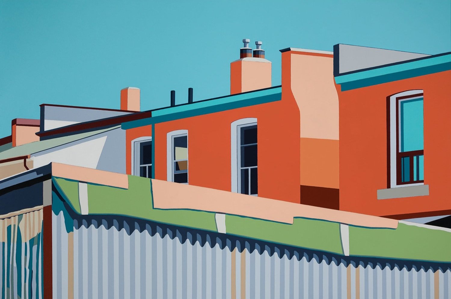
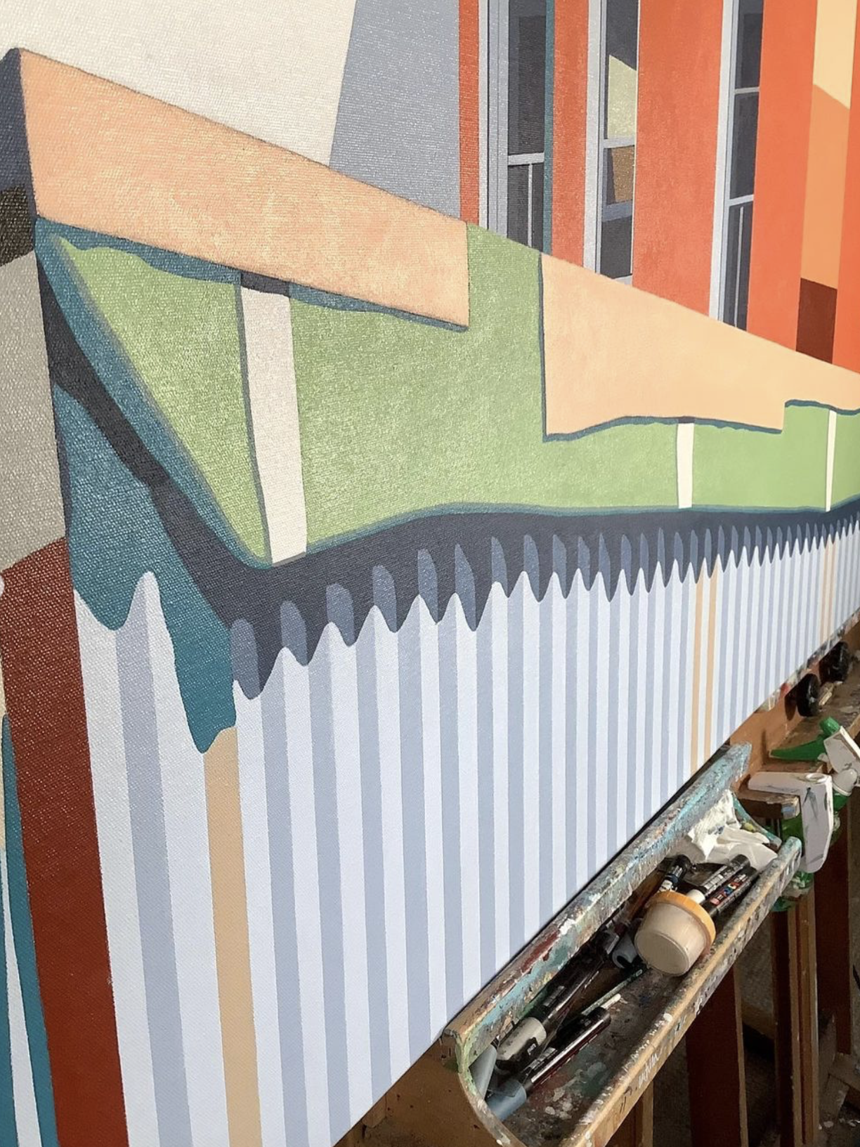

“I break down the city into component parts. Shadows, buildings and skylines all become part of the same plane and transform into pieces of a puzzle. Using acrylic paint, I explore a theme common to the urban experience - how community connects us all.
The reference for Hold The Line is an alleyway / backyard view in the Queen St West, Glenlake community. I was fascinated by that metal fence - and the angles of these homes.”